Interpreting the right time to buy and sell stocks

As I have said there is many variances and details that go into interpreting the right time to buy and sell stocks at a certain time.  I have showed a few simple ways to help improve and understand the right time to buy and sell stocks.  When looking at a stock or security you are interested in.  I will include my top five keys below that I always like to check on before interpreting the right time to buy and sell stocks .  This can differentiate depending on what type of trader you are.  Moving average strategies are very popular and can be custom fit to any time frame, suiting both long term investors and short term investors.  The (MA) or moving average is a simple technical analysis tool that many traders focus on heavily.  The (MA) smooths out price and data by creating a constantly updated average price. This average is then taken over a unique period of time, like 5 days, 30 minutes, 30 weeks, but for you as a trader you can decide what to look at based on the type of trader you are.

#1-  Volatility as explained in my first post which I believe is one of the most important factors to get a good feel for where that stock is heading and how the majority of investors are interpreting the right time to buy and sell stocks due to resistance points.  Please follow the link to learn more about volatility https://www.vebbit.com/blog/read-stock-charts/

#2-  The next thing you will always want to take a look at is the (P/E) or price to earnings ratio as explained better in my previous post.  Please follow this link on my previous post www.vebbit.com/blog/using-price-earnings-ratio-value-stock to learn more about the (P/E) ratio.  You will always want to look at this and get as much information from the last earnings report.  The reason I say that is because if you are looking at a growth stock you would definitely want to make sure they are growing at or faster then the pace they predicted for that earnings report.  This is another very simple thing to look at just by looking up the stock ticker through finance.google.com  They will have the (P/E) ratio already computed for you.

#3-  Now that you have learned a few things and multiple signals of what stock or security you are looking to purchase.  You now have a better idea of what to look for on charts.  Please refer to previous links about the different charts I have explained to recognize the patterns and resistance points.  Also, after you have looked into a certain stock there are many more variables then just these five keys.

#4-  After you have dug into the first three keys and got a better idea of what that stock is doing.  You will also want to take a look at the market as a whole.  There is many things that can effect a certain group of stocks or securities.  For example, lets just say you were looking at a stock in the gaming industry and they are coming out with earnings.  Two gaming industry stocks (ATVI) or Activision Blizzard might miss on earnings and so other stocks that are in that sector might fall as well.  An example of a few other gaming sector stocks could be (EA) or Electronic Arts, (TTWO) or Take-Two Interactions, (SNE) Sony.  So if one or two miss earnings it can affect the whole sector for that day.  Another reason you would want to take a look at the whole market is the different sectors that have been grouped together.  The main sectors are shown below so if you were playing a Energy stock, Basic Materials, and Financials.  You will want to be careful playing those certain sectors.

Sector summary

Sector Change % down / up
Energy -0.78%
Basic Materials -1.45%
Industrials -0.08%
Cyclical Cons. Goods … -0.30%
Non-Cyclical Cons. Goods… +0.22%
Financials -1.20%
Healthcare -0.35%
Technology -0.02%
Telecommunications Servi… -0.03%
Utilities +0.10%

#5-  Now that I have discussed four of the main keys.  Lets decide what type of trader you are short term, long term, or both.  This is very important when pertaining to certain stocks or securities.  Are you looking for a long investment that has a good dividend and stock buybacks.  Or you could be looking to play a short options trade or earnings play. If you are going to play options I must emphasize that you watch the stock very closely.  There are many things that can make stocks move big percentages in a very short time. Lets just say for example you were playing (VRTX) Vertex Pharmaceuticals Inc. at the beginning of this year.  If you were not paying attention this could be a huge problem. Vertex was giving investors high hopes with a couple of drugs getting approved by the FDA.  It also had some promising drugs that were in the works.  So lets say you had bought some call options and were more than happy with the return you had seen starting the year.  Well if you take a look at that company from January 6, 2016 to just one week later January 13, 2016 Vertex had dropped well over 30% which would mean your call options are probably now worthless.
 

Using the price-earnings ratio to value a stock

What is a price-earnings ratio or (P/E) ratio?

Using the price-earnings ratio to value a stock investors have long considered this (also known as the (P/E) ratio for short) a useful metric for evaluating the corresponding attractiveness of a certain company’s stock price. This theory was made popular by Benjamin Graham, who was dubbed the “Father of Value Investing”Graham preached the virtues of this financial ratio as one of the quickest and easiest ways to determine if a stock is trading on an investment or a analytical basis. Keep in mind as you learn about how to use the (P/E) ratio, there is many more factors that go into trading a certain stock. There are some significant limitations if you were just to use a price-earnings ratio, partly due to accounting rules estimates many investors just predict out of thin air when guessing future growth rates.  Regardless, it is something you should know by heart to better help you evaluate a stock.

Simply put, the (P/E) ratio is the price an investor is paying for $1 of a company’s earnings or profit. In other words, if a company is reporting diluted earnings per share of $2 and the stock is selling at $40 per share, the p/e ratio is 20 ($40 per share divided by $2 earnings per share = 10 p/e).

This can be very useful because, if you invert the (P/E) ratio and divide it by 2.  This is how you can also determine the yield of the stock. Also remember, just because a stock is cheap does not mean you should buy it. Many investors prefer the PEG Ratio instead, because it is also factoring in the growth rate of the security.  Even better is the dividend adjusted PEG ratio because this will take the basic price-earnings ratio and adapt it for both the growth rate and the dividend yield of the stock.  Please stay tuned as I will be letting you know more important factors throughout.  Also I will be showing you how to take all these factors into account and improve your portfolio by knowing when to get into a stock at a certain price and when to get out.

How to read a inverted head and shoulders chart

What is a inverted head and shoulders chart?

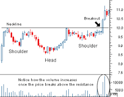
With a inverted head and shoulders chart the neckline is drawn through the highest two points of the troughs. As you can see in the chart the neckline is showing you that at around 10.0 is right about the range they got to. When you see a downward sloping neckline this is a signal showing weakness and is less reliable as a reversal signal.

You can determine the extent of the breakout move by carefully considering the breakout point. This can be estimated by measuring from the top of the middle trough up to the neckline.

How to read a inverted head and shoulders chart?

As you can see on the chart below the breakout point is after it breaks through the 10.0 neckline.  Also I expressed the importance of volatility and how to interpret it in my first post.  As you can see when the stock does break through the 10.0 mark.  The volatility spikes showing you that there is increased interest in the stock and that there is willing investors to purchase the stock at a higher price.  Please refer to my first post about volatility to help you better understand how to read stock charts.


How to read a head and shoulders chart

What is a head and shoulders chart?

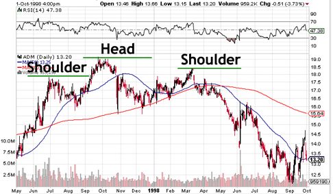
A head and shoulders pattern consists of a peak followed by a higher peak and then a lower peak with a break that is below the neckline . The neckline is drawn through the two lowest points on the intervening channels and these can slope upward or downward. As you can see on the chart below on the 2 shoulders the peaks are in the range between 17.5 and 18.5 but when it gets to that range it is encountering resistance.  As you can see this is showing a downward sloping neckline. A downward sloping neckline is also usually a bit easier to follow.  You can determine the extent of the breakout move by measuring from the top of the middle peak down to the neckline. This target is then projected downwards from the point of breakout.  Please stay tuned, as I will be posting an inverted head and shoulders chart which will be projected to rise from the breakout point.

How to read and trade a double top chart

What is a double top chart?

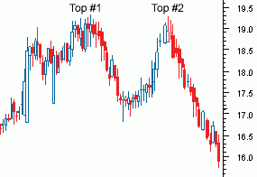
A double top chart is a charting pattern used in technical analysis.  What is technical analysis?  In finance, technical analysis is a security analysis methodology for forecasting the direction of prices through the study of past market data, primarily price and volume. The double top pattern is found at the two highest points of the chart.  As you can see in the chart below “Top #1” and Top #2 is in the range between 19.0 and 19.3 before it starts to trend down. The double top pattern is found at the highest ranges of a progressing upward trend. This is a clear signal that the progressing upward trend is showing resistance to break through that range. Spotting this trend is very helpful and a great indicator that investors are hesitant to purchase this security when it is in that range.  In fact it is showing you that the investors are seeing resistance at that range.  As you can see on the chart the “Top #1” section the investors sell off their shares to a previous resistance level in the range of 17.0 and 17.3. The next stage of this pattern will see the price start to move back towards the level of resistance found in the previous run-up which is “Top #1”.  In this case when you see the security reach the same range in “Top #2” which is right around the 19.0 and 19.3 range and is not able to break through the resistance.  Now that you have spotted the double top pattern you will start to see the stock trend downward.


Double Top

How to read and trade a double bottom chart

What is a double bottom chart?

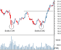
A double bottom is a charting pattern used in technical analysis.  What is technical analysis?  In finance, technical analysis is a security analysis methodology for forecasting the direction of prices through the study of past market data, primarily price and volume. It shows the drop of a stock, a rebound, another drop to the same (or similar) level as the original drop, and finally another rebound.  The double bottom looks like the letter “W”. The twice touched low is considered a support level.

The next thing I will be focusing on is how to read and trade a double bottom.  As you can see in the chart below with “Bottom #1” and “Bottom #2”.  The stock or index are encountering resistance/support right around the 16.5 area on two separate occasions.  Now that we have spotted the double bottom. We know that this stock has had support by rebounding twice around 16.5 area.  With that being said just because you see a double bottom.  There are still many more factors that you will want to take in account before pulling the trigger and investing in a company. So I will be making plenty more posts explaining double top charts head and shoulders charts and the advantages they have.  Along with a bunch of key factors and technical analysis on how to interpret P/E ratios, dividends, stock buybacks, etc.


Double Bottom

How to read stock charts

In this post I will be showing you the basics of how to read stock charts and the right way to interpret them.  I will try to keep it as simple and easy to understand the different variances and factors that go into making the right decision.  There are many variables and ways you can read these stock charts to help identify when to buy or sell to maximize your profits.  The first piece of advice I would give you before we even start looking at stock charts and all the different variables is what type of trader are you.  This can be a key factor if you are planning on day trading or playing options.  If that is the case you would want to pay very close attention to the volatility of the stock.  This can be a very telling sign when learning how to read stock charts.  Which I will go into further in another post. Also things can happen very fast in the market and I want you to be on top of it by noticing key factors that I will be teaching you using stock charts.  That being said looking at a daily stock chart is not always going to give you the full spectrum.  You would still want to look at weekly, monthly, and even the past years charts.  There are many reasons why you want to take a look at these.  This pertains to anyone trading stocks, bonds, etc. long or short holdings.  The first thing I will get into is volatility and how to interpret this.

Interpreting High Daily Volume

In general, it is a sign of strength when stock prices rise on higher than average volume. This implies increased demand. In other words, the value of the stock is rising and the number of investors are willing to pay the higher stock price. When you have a stock that falls on higher than average volume, this is a sign of weakness and implies excess supply. The value of the stock is falling and the amount of investors trying to get rid of their shares is increasing.

Interpreting Low Daily Volume

In General Price movements that occur on lower than average volume are interpreted in the opposite way. When you have a stock rises in price on lower than average volume, you might take a look and be happy that the stock has increased. But you really should also be concerned that the number of investors willing to buy that stock at a higher price has fallen. The lower the volume, actually means you should be worried about the strength of that stock. When you have no buyers left at the higher prices, and all the investors are selling the stock, there is only one way the stock will go and that is down.

The same thing applies if a stock falls on lower volume, only in reverse. Falling prices mean the value of the stock has decreased, but with low volume this suggests that fewer investors are willing to sell their shares at the lower price. So after investors stop selling the stock as much and they start buying more shares rather than selling the stock, the price of the stock should rise. Interpreting prices and volume movements can be tricky, however if you know how to read stock charts, it can greatly improve the timing of your buys and sells and help you to figure out how long you should hold a stock. To recap, when you are learning how to read stock charts for a company that you own, you would like to see it rise on heavy volume and fall on lighter volume. This is the sign of a healthy stock whose price is going up.  Also I will be doing more posts on on how to read stock charts so please stay tuned.